I’m sure that a recurring conversation in many households is on the topic of practicality vs. beauty! Preferences often differ in relation to the interior design of a home – appropriate lighting levels, colour palettes or unfinished DIY ambitions.
To illustrate my point, I will outline some ‘hypothetical’ examples and I will simply refer to this practicality-obsessed ‘fictional’ person as The Engineer.
In The Engineer’s opinion, functionality trumps everything. I do agree to a certain extent – Form does need to follow function. HOWEVER, there has to be a happy medium, surely?! Interior Design doesn’t have to boil down to a competition between practicality and beauty. Why not both?
Here are some fascinating hacks The Engineer has deployed around his house and how I plan to address them with a new design proposal!
Engineer’s Home Hack #1
Duct-Taping a Mat to the Floor
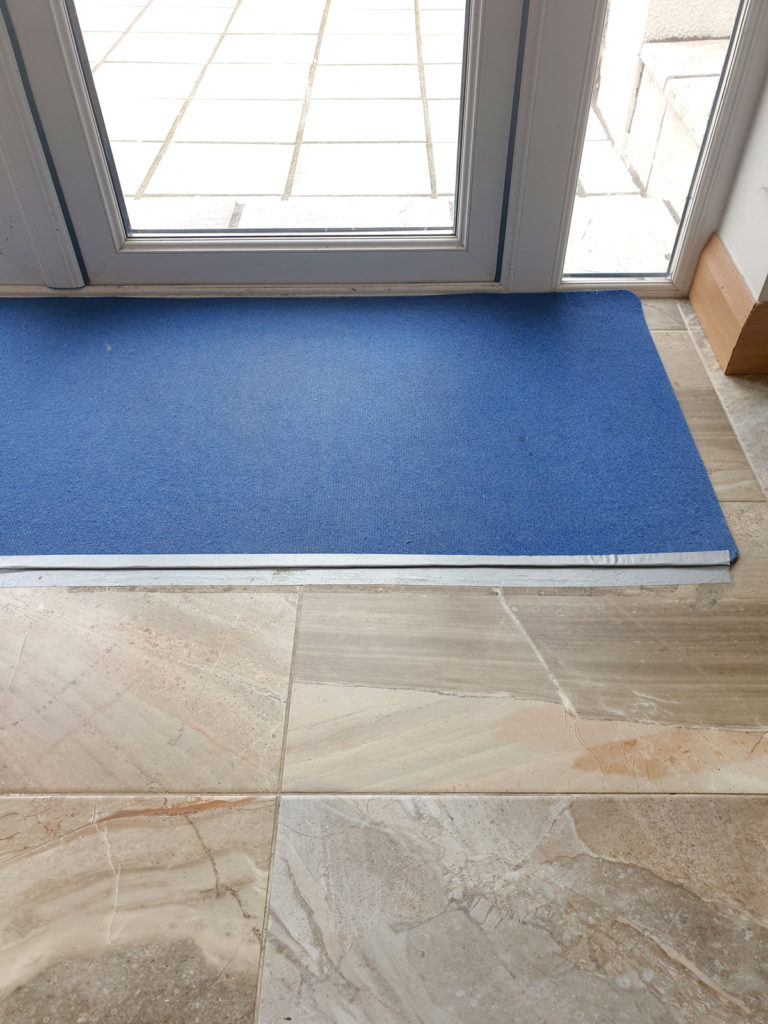
I mean actual duct-tape. Ok, who’s with me? Duct-taping a mat to the floor is just not on. The mat in question features prominently in the kitchen space at the doors leading to the back garden. Now to be fair to The Engineer, it is highly convenient that the mat doesn’t slide around the place, but surely a bit of non-slip backing would have done the job.
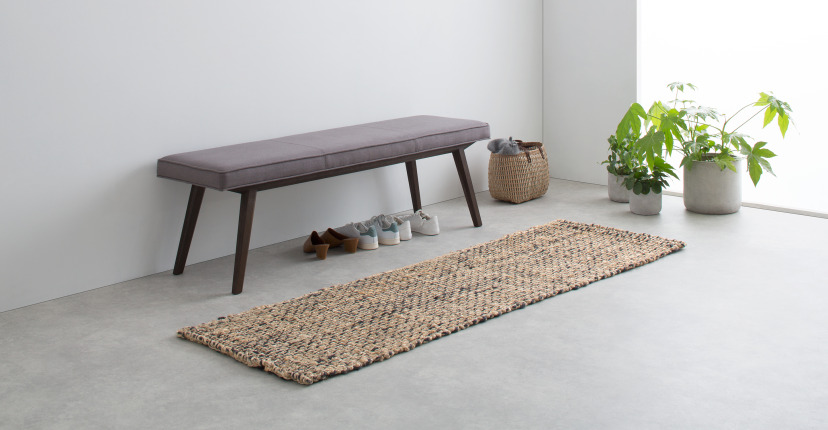
And don’t get me started on the style and colour of the mat. I was not consulted prior to the purchase of this item. I am in the process of choosing a more aesthetically-pleasing non-slip mat to replace this duct-taped blue eyesore. I am considering a bit of jute for its durability and natural beauty!
Practical 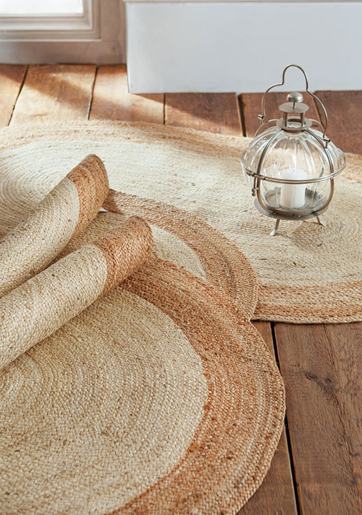
Beautiful
Engineer’s home hack #2
Bulldog Clip on the Toothpaste Tube
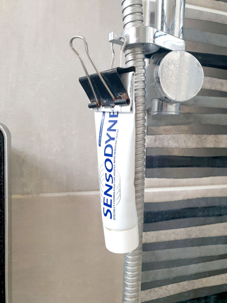
I have to admit – this one is genius. The Engineer puts a bulldog clip on the end of the tube of toothpaste so that it can be hung in various places around the bathroom. It also ensures that every last drop of toothpaste is squeezed up from the bottom as you use it.
It’s not the prettiest bathroom accessory, but it is fairly handy.
My favourite toothpaste happens to look much prettier. Not to mention all-natural ingredients and plastic-free! (Like this one from Reuzi!) Or you can make your own!
Practical 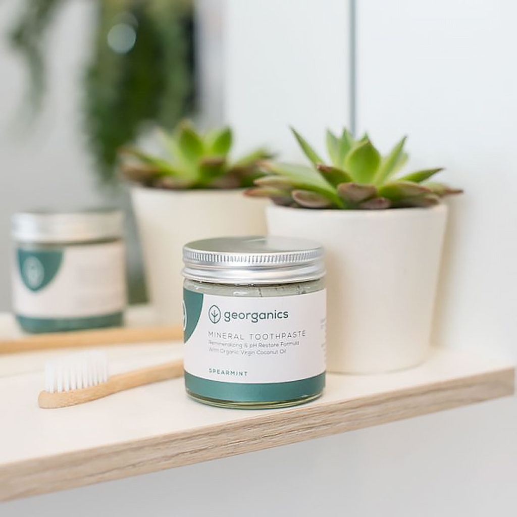
Beautiful (and Eco-Friendly!)
Engineer’s home hack #3
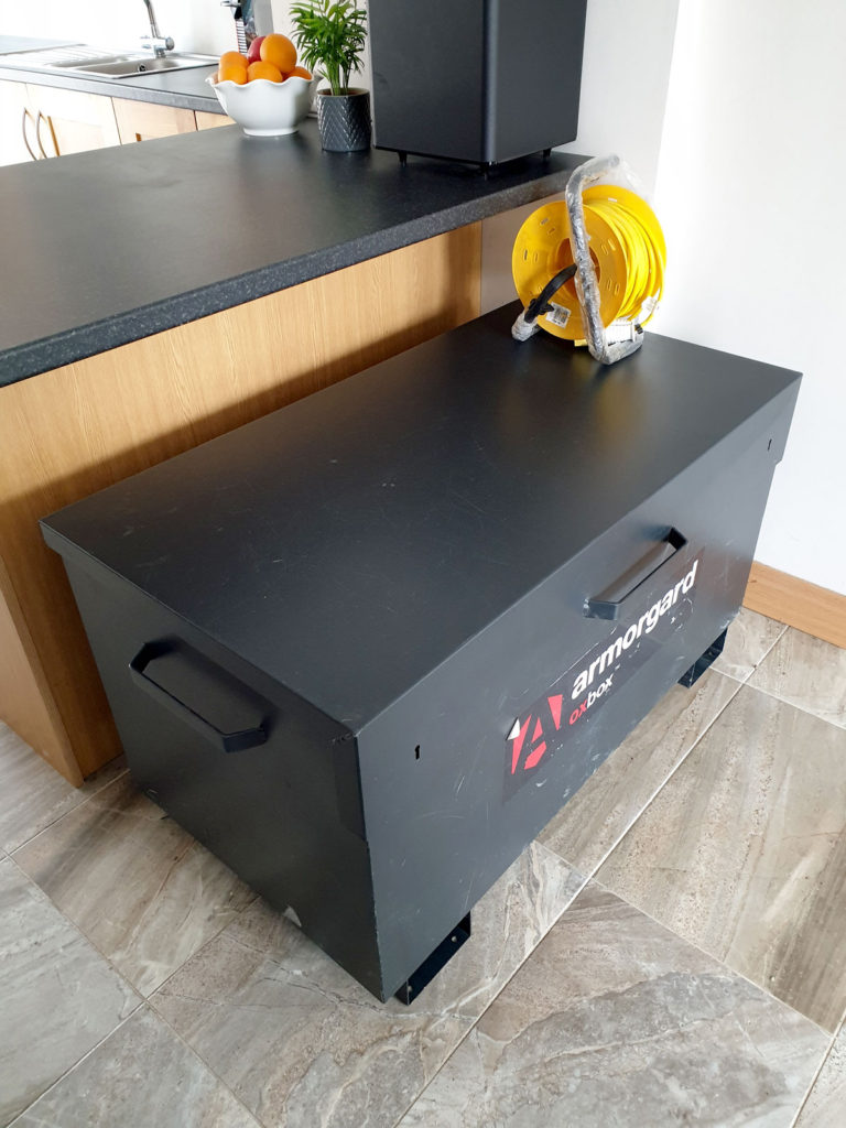
Giant Metal Storage Container in the Living Area
Again, uber functional in fairness. Storage is vital for living spaces. We are in complete agreement on that one. Having an organized and clutter-free home is known to create a calm environment and reduce stress.
HOWEVER, a large, dark, metal box taking over the small living space of this cute little townhouse? It’s a big NO from me, Sunshine.
There are usually a few tools strewn on top of it for good measure.
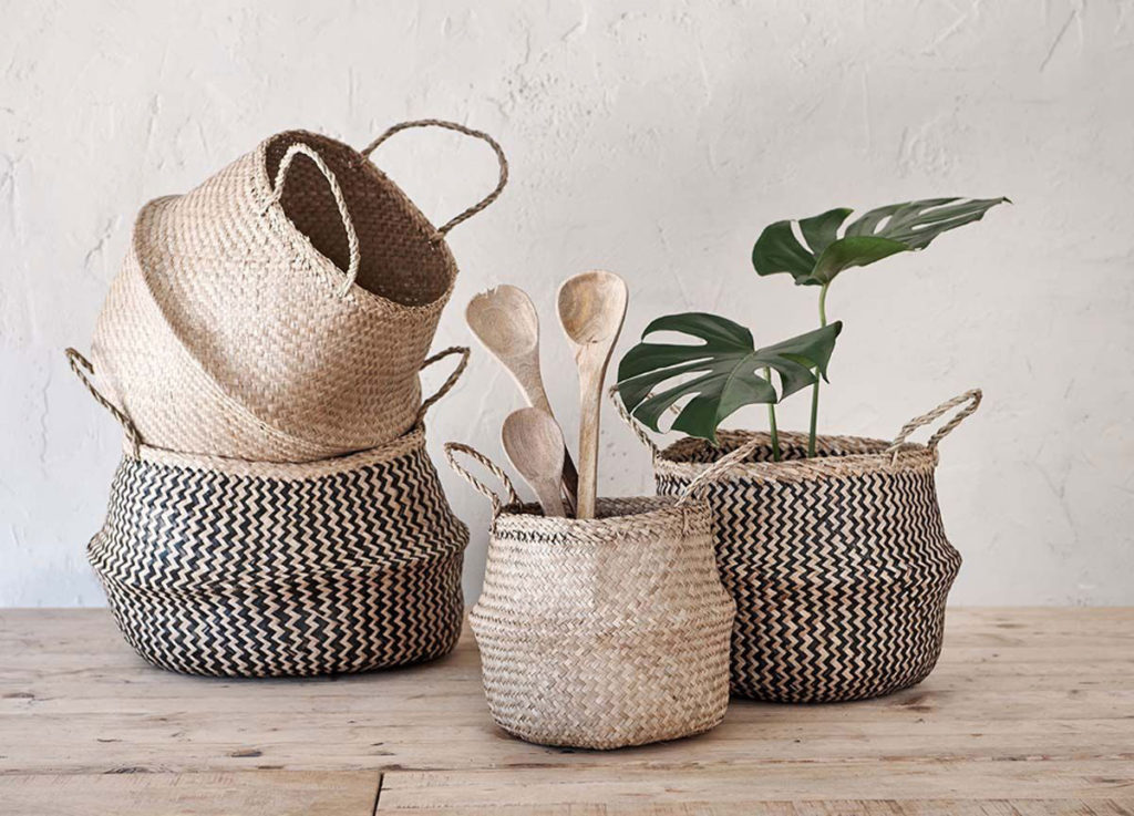
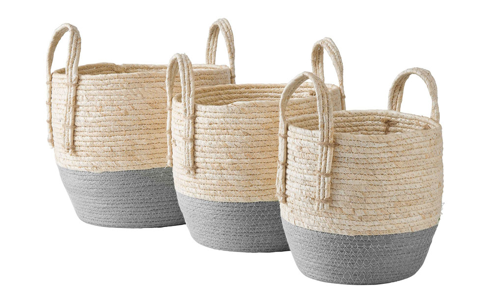
Thankfully, The Engineer is in the process of building a secure shed in the yard, so I’m looking forward to this monstrosity moving out to its new home. I plan to design in some clever and eye-pleasing storage solutions into the living area once that space is cleared. Some open shelves with woven storage baskets would make a lovely addition.
Beautiful
Engineer’s home hack #4
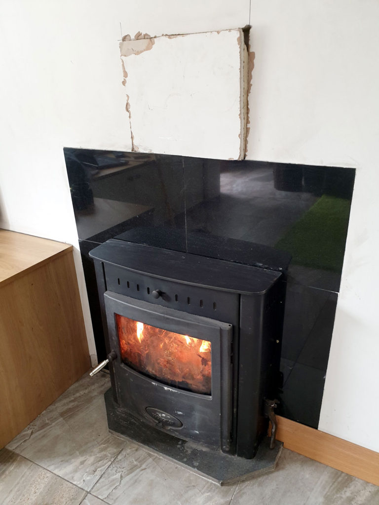
Hole in the Wall for Maintenance
This handy little removable cut-out has been the focal point of the living area for quite some time now. The Engineer hacked the wall open to fix a minor issue with the stove several years ago and has left it accessible ‘just in case’. It can be popped out at a moments notice. Just to be clear though, access has not been needed since the original issue was sorted years ago!
I’m currently deciding on paint colours for the house which will freshen everything up once this little piece is patched in. This ‘feature’ will not be featuring in my re-design of the space. 😉
Engineer’s Home Hack #5
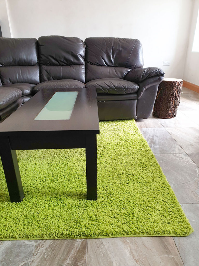
The Acid-Green Rug
It genuinely hurts my eyes to look at it.
Again, obviously, I was not consulted prior to the purchase of this rug. The Engineer does not seem to realise that his other half is a professional Interior Designer. ‘Ah sure 40 quid in Aldi, couldn’t be bet’. I informed him that it most certainly could be ‘bet’. Maybe not in price, but in quality and style and environmental impact.
With the ground floor of the house completely tiled in porcelain, the living area was crying out for something soft underfoot. Unfortunately, this particularly acidic shade of green is not, in my opinion, a suitable colour to have so predominantly in a relaxation zone.
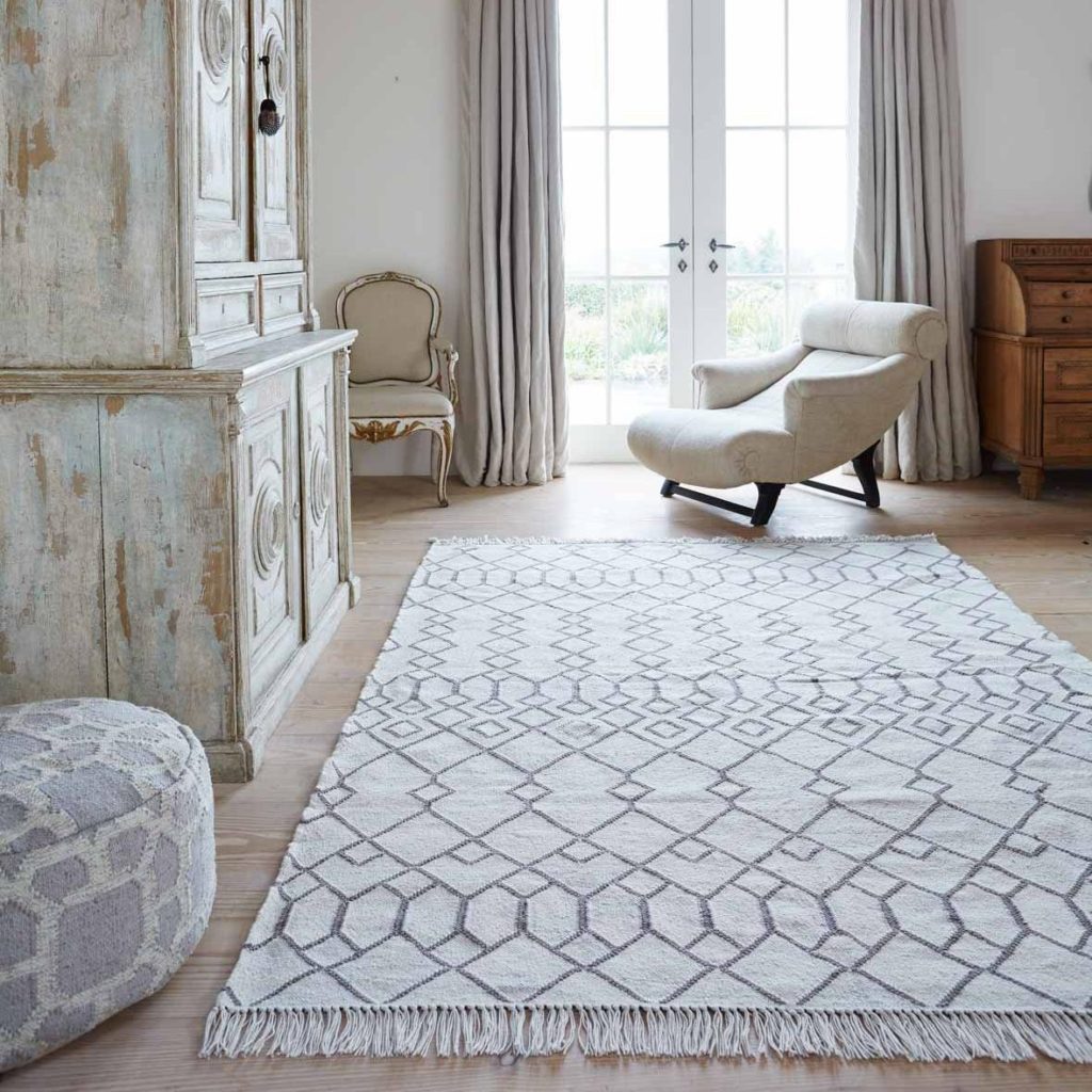
I have my eye on a large, stylish rug from Weaver Green. Apparently, it has the look and feel of real wool but is made entirely from recycled plastic bottles!
If anyone happens to need an acid-green rug, one shall be up for grabs in the near future!
Practical 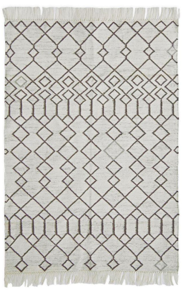
Beautiful
Engineer’s home hack #6
Lighting as Bright as a Doctor’s Surgery
The Engineer has a preference for extremely bright – some might say harsh – lighting, particularly in the kitchen-dining area. Why he needs to be able to see his food so vividly while he hoovers dinners up in 0.3 of a second is beyond me. I’m all about getting the lighting level just right: Not so bright that you feel like you’re in a doctor’s surgery, but not so dark that you can’t make out what’s in front of you.
In my re-design of the house, I would like to layer different lighting types – ceiling lights, wall fixtures, table and floor lamps. Layering light in this way will create a cosier atmosphere while still being practical.
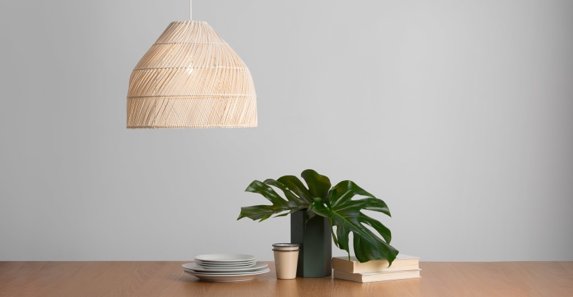
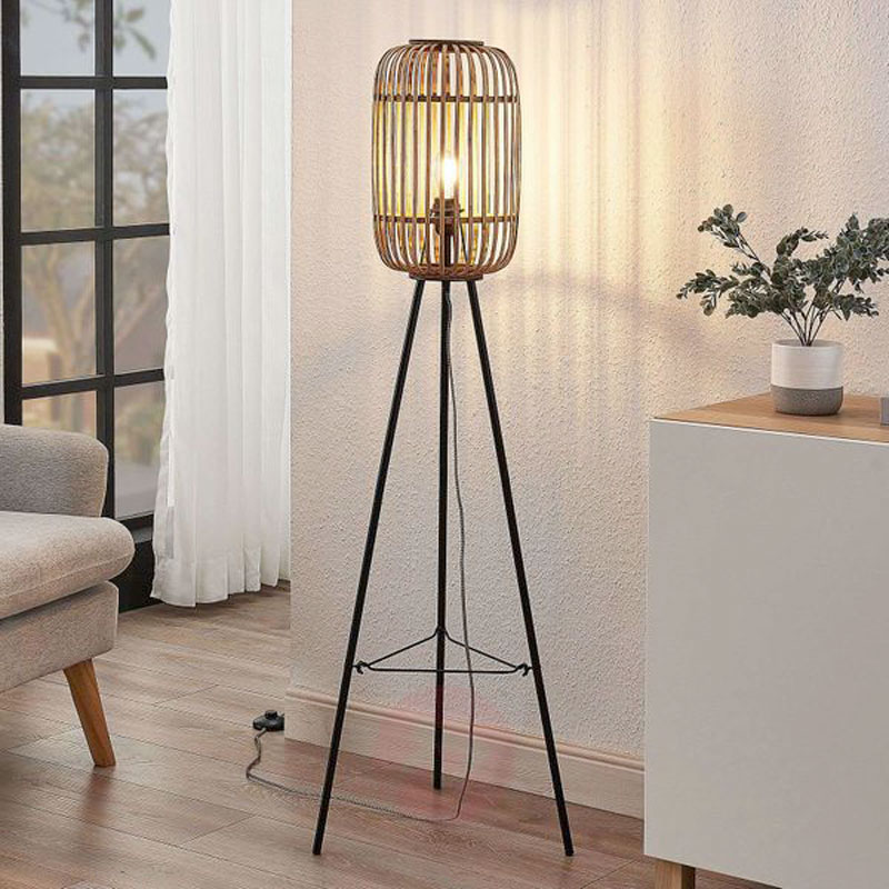
I actually had a dream the other night that I was an Interior Design Couples Counsellor (seriously)! I was helping desperate couples that were having trouble agreeing on lighting preferences in their homes. I talked them through the practicality of layering light and the joy of dimmer switches. I am delighted to report that I managed to save multiple imaginary relationships.
After telling a few friends about the dream, I was informed that these kinds of issues are a ‘thing’ in real life. I think I see a gap in the market. So if anyone is having home decor related relationship troubles, you know where to find me!!
Balancing Practical Home Hacks with the Beauty of a Cohesively-Designed Space
It’s all about compromise. Or at least making The Engineer think you are compromising. For instance, I have recently fashioned an entirely practical side table/stool out of a natural wood log.
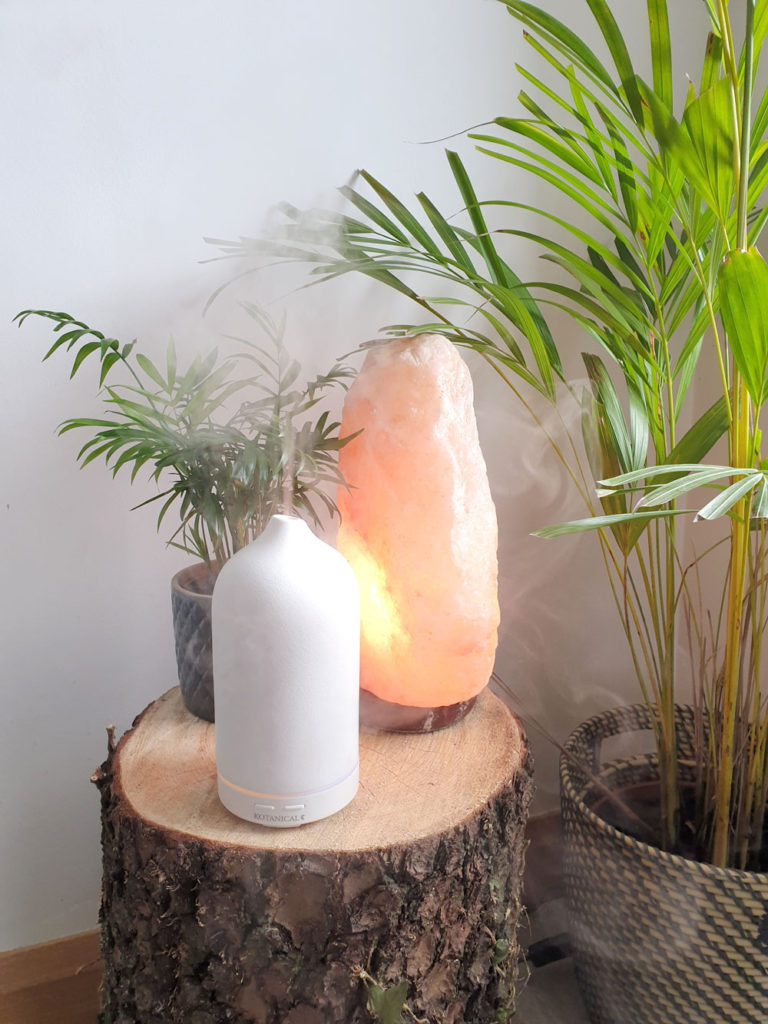
The Engineer is delighted with himself having an easy-to-reach perch for his cup of tea or his can of Murphy’s. It’s quite the improvement for him, no longer needing to stretch awkwardly from his reclining throne to reach the low central coffee table.
And I am equally as delighted with myself, using it as a charming little side table and plant stand. Now tell me that’s not a win for both practicality AND beauty!
Whipping this (Practical) Bachelor Pad’s Metaphorical Ass into (Beautiful) Shape
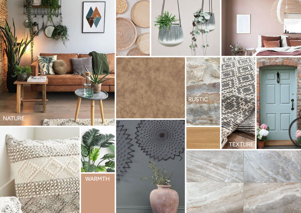
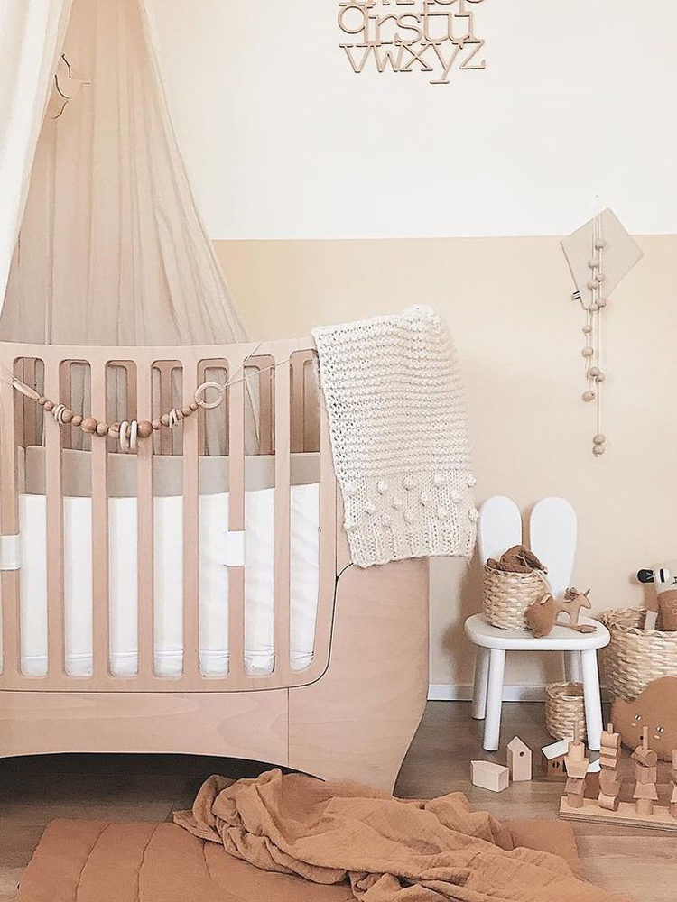
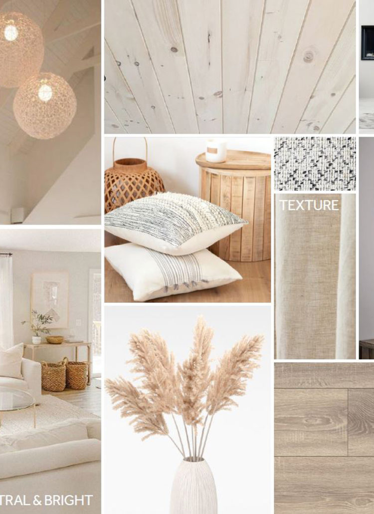
To tackle the engineer’s unsightly home hacks, I took the liberty of putting together a mood board exhibiting a new and very considered design approach for the house.
As well as the look & feel of the house, I will, of course, also factor in practicality: Re-arranging the layout to create a better flow; incorporating intelligent storage solutions; and being sure to include non-slip rugs and appropriate lighting levels to prevent future debates. 😉
How to Create a Mood Board to Convince The Engineer to Consider a Home Refresh?
- Decide on a starting point based on something that already exists in your space. Select elements you cannot change or items that you particularly like, and build your style from there. Think existing flooring or a piece of artwork that brings you joy
- Make sure that all other elements you introduce work with your starting points. The colour palette, furniture, and finishes do not necessarily need to completely ‘match,’ but they should work cohesively together.
- Find inspirational pictures by trawling through magazines, Pinterest, or your favourite blogs. While keeping your starting point in mind, select the images that you are most drawn to.
- Collate these images into a Mood Board – either on-screen or the old school way.
- Present said Mood Board to The Engineer and explain the benefits this overhaul would have to your wellbeing and to your relationship!
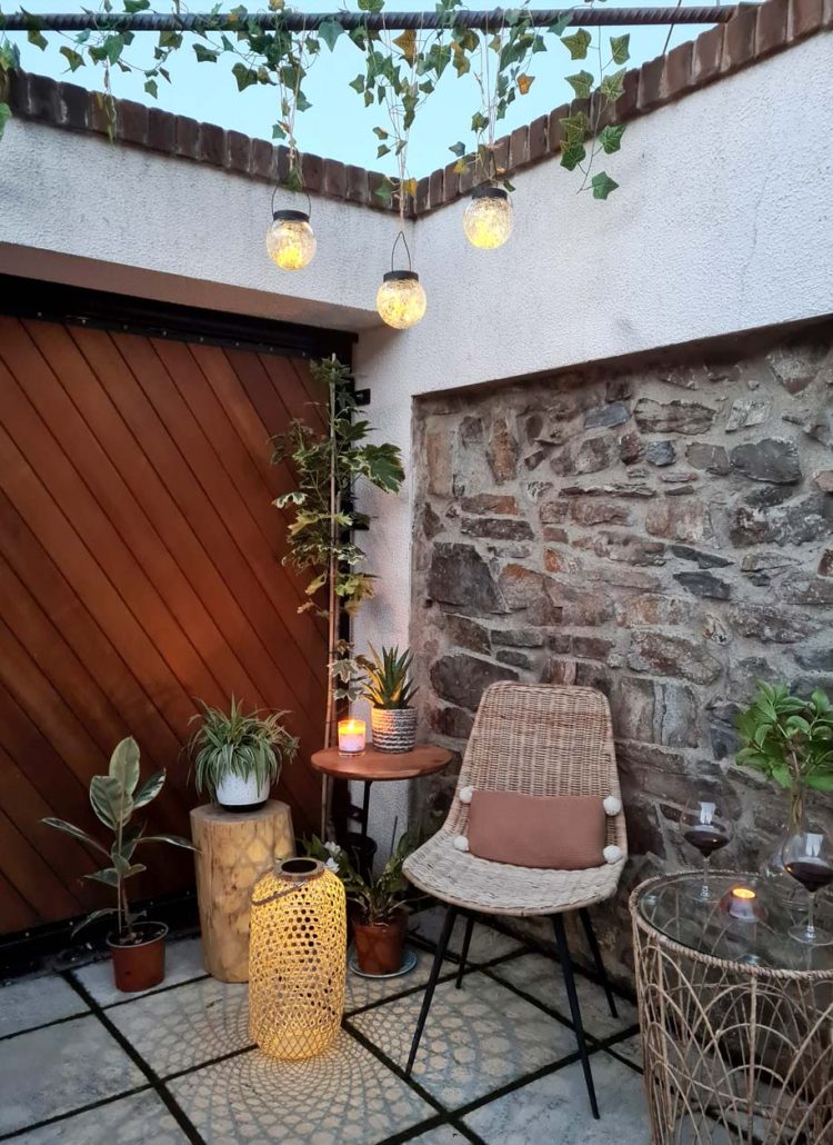
My starting point for this design was the old stone walls in the back garden. They are beautifully rustic, full of texture and have a soothing palette of colours that I would like to bring inside. Muted terracotta and steely grey-blue tones for the walls, varying textures in the soft furnishings, and delicate touches of greenery to connect us more with nature.
Since showing the mood board to The Engineer, he is coming around to the idea of a bit of a refresh. He is now on board with the idea that our home environments have a massive impact on health and wellbeing.
We plan to keep these eco-friendly design principles in mind when refreshing the house. Starting with a fresh lick of paint (non-toxic) and mindfully introducing new elements, we can transform this little gem into a Rustic Townhouse Retreat.
Fare thee well, bare Bachelor Pad!
At the end of the day, Love conquers all – even a mat duct-taped to the floor.. just about! 😉

Leave a Reply